Pages, page banner and breadcrumb
Standard pages such as About, plus the page banner and breadcrumb.
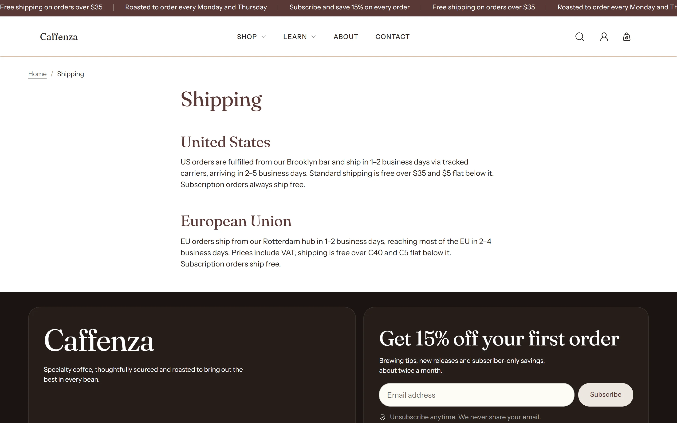
Create pages in Online Store → Pages. The page text you write in admin shows in the Page section.
Important
If you add a Page banner with the page title as H1, turn on Page title is shown by a section above in the Page section, so the page has one H1.
Screenshots


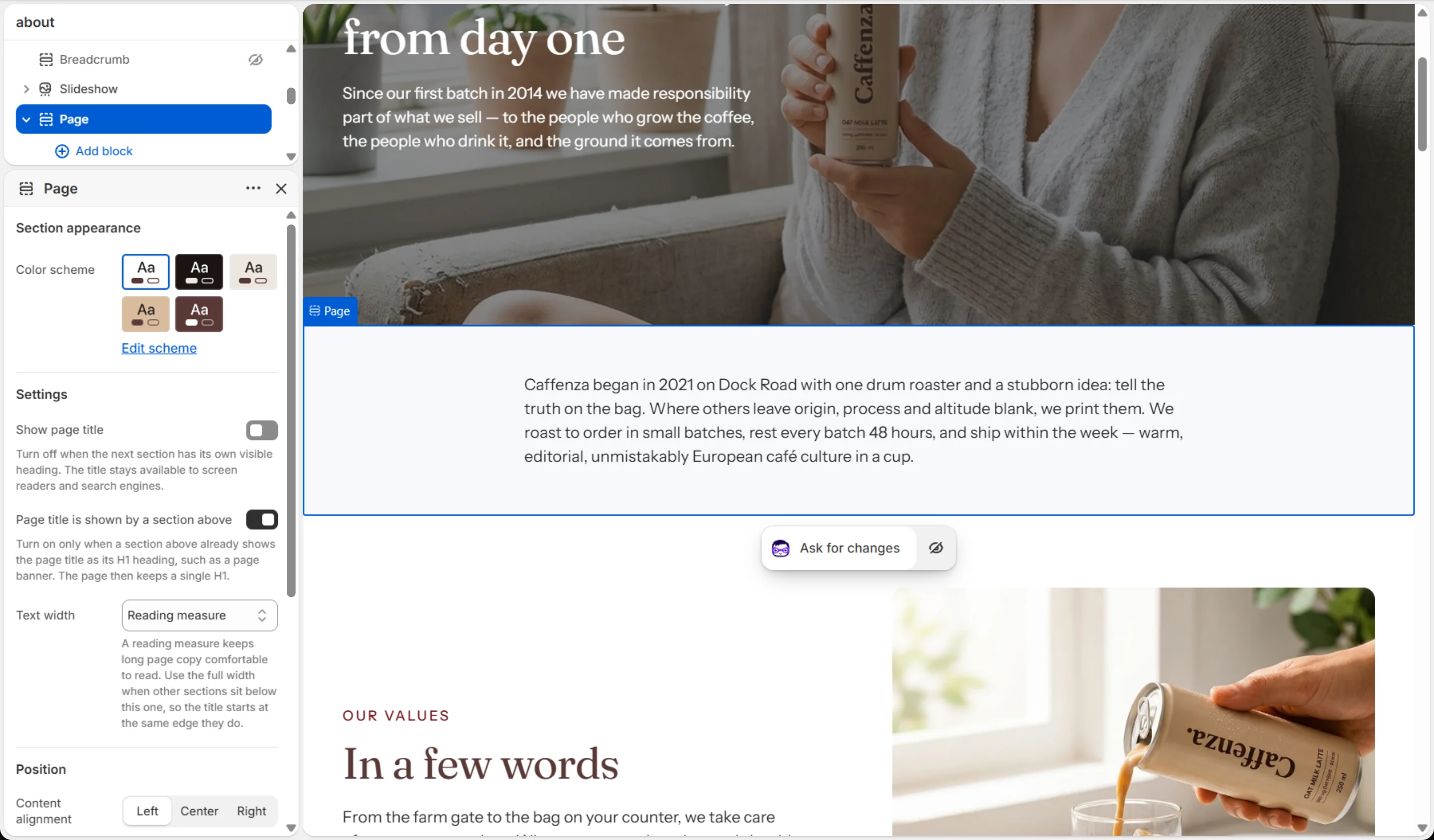
Page settings
| Setting | Options | What it does |
|---|---|---|
| Section appearance | ||
| Color scheme | Color scheme | |
| Settings | ||
| Show page title | On / Off | Turn off when the next section has its own visible heading. The title stays available to screen readers and search engines. |
| Page title is shown by a section above | On / Off | Turn on only when a section above already shows the page title as its H1 heading, such as a page banner. The page then keeps a single H1. |
| Heading size | Small · Medium · Large · Extra large | |
| Text width | Reading measure · Full width | A reading measure keeps long page copy comfortable to read. Use the full width when other sections sit below this one, so the title starts at the same edge they do. |
| Position | ||
| Content alignment | Left · Center · Right | |
| Mobile content alignment | Left · Center · Right | |
This section also accepts Custom Liquid blocks and app blocks. It also has the shared Animate on scroll and Section spacing settings.
Page banner settings
| Setting | Options | What it does |
|---|---|---|
| Section appearance | ||
| Color scheme | Color scheme | |
| Content | ||
| Title | From the page · Write my own | "From the page" uses whatever this template is showing — the page, collection, blog, article or product name — so the banner works on any template without retyping, and renaming the record renames the banner. |
| Heading | Text (bold, italic, links) | Italicized words switch to the Accent font from Theme settings → Typography. They stay italic and keep the color of the text around them. |
| Heading size | Small · Medium · Large · Extra large | |
| Heading level | H1 · H2 · H3 · H4 · H5 · H6 | Leave as H1 on a page that has no other H1. If the Page section below also shows the title, turn on its "Page title is shown by a section above" setting so the page keeps a single H1. |
| Subheading | Text (bold, italic, links) | |
| Subheading size | Small · Medium · Large | |
| Text | Rich text | |
| Text size | Small · Medium · Large | |
| Show breadcrumb trail | On / Off | Puts the trail inside this band instead of in a strip above it. Remove the separate Breadcrumb section when you turn this on — each one describes the trail to search engines, and a page should describe it once. Follows Theme settings → General and never shows on the home page. |
| Buttons | ||
| Button label | Text | |
| Link | Link | |
| Button style | Primary · Secondary · Ghost · Link | |
| Button size | Small · Medium · Large | |
| Open in a new tab | On / Off | |
| Second button label | Text | |
| Link | Link | |
| Second button style | Primary · Secondary · Ghost · Link | |
| Second button size | Small · Medium · Large | |
| Open second button in a new tab | On / Off | |
| Background | ||
| Background | Image | |
| Mobile background | Image | Optional. Falls back to the desktop media when empty. |
| Prioritize image loading | On / Off | Turn on only when this section is above the fold (visible without scrolling), for example at the top of the home page. Loads its first images immediately instead of when they scroll into view. |
| Overlay color | Color | |
| Overlay opacity | 0–100 % | Tints the media with the overlay color so text stays readable. Lower it with care — check your text contrast. |
| Settings | ||
| Section height | Adaptive (fit content) · Small · Medium · Large | |
| Mobile section height | Adaptive (fit content) · Small · Medium · Large | |
| Content width | 400–1000 px | |
| Content alignment | Left · Center · Right | |
| Mobile content alignment | Left · Center · Right | |
| Animations | ||
It also has the shared Animate on scroll and Section spacing settings.
Breadcrumb settings
| Setting | Options | What it does |
|---|---|---|
| Section appearance | ||
| Color scheme | Color scheme | |
| Settings | ||
| Alignment | Left · Center · Right | |
It also has the shared Animate on scroll and Section spacing settings.