Multi-column
Columns with icons or images, text and buttons.

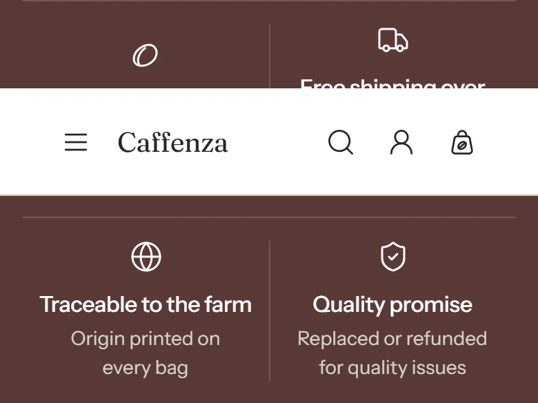
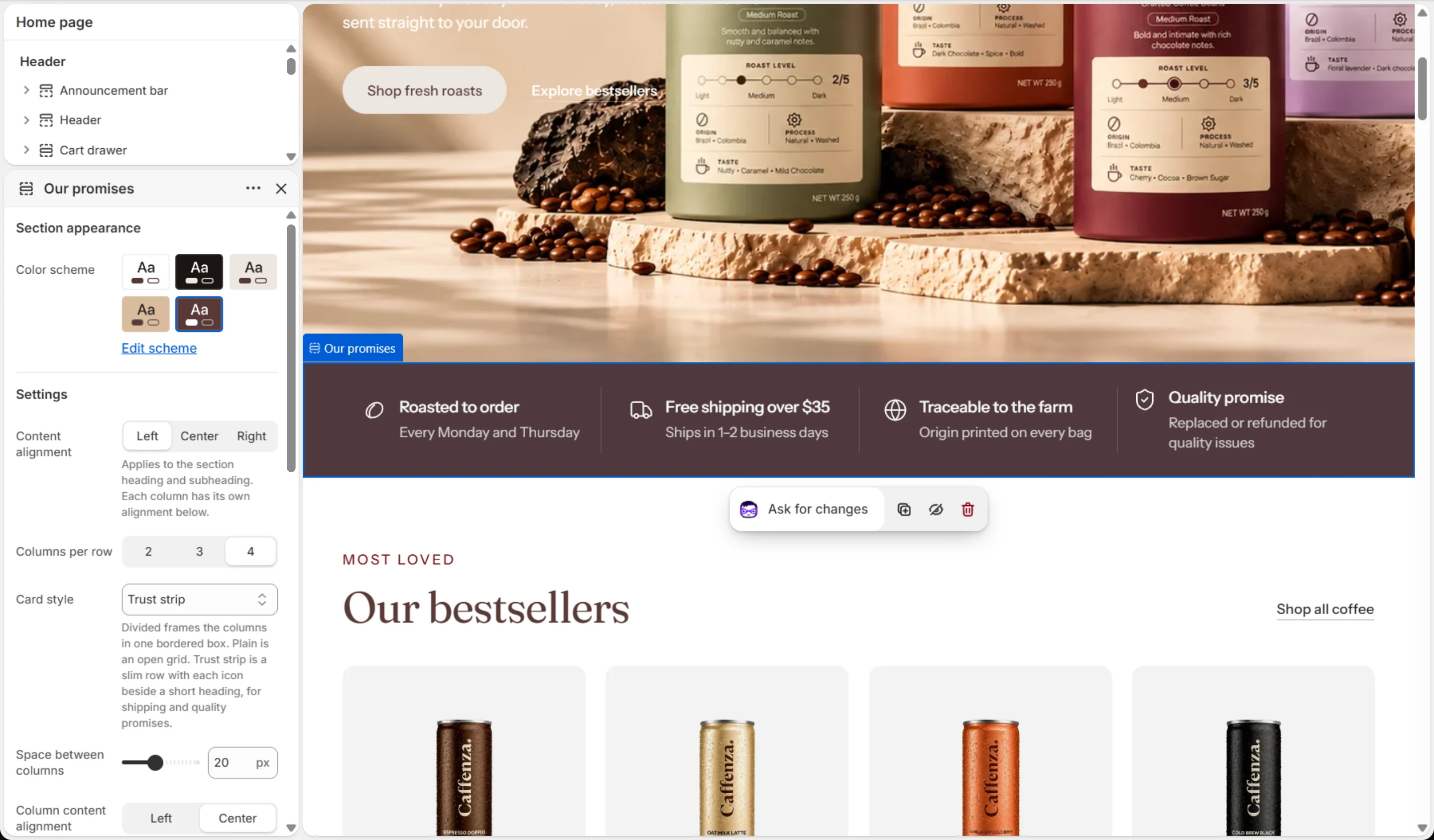
Show benefits such as “Roasted to order”, “Free shipping over $40” and “Ethically sourced”.
How to add it
- In Shopify admin, go to Online Store → Themes and click Customize.
- Open the page from the page picker at the top of the editor.
- In the sidebar, click Add section and choose Multi-column.
- Fill in the content, then click Save.
Tips
- Choose the Trust strip card style for a slim row of promises under the hero.
- Coffee icons included: coffee bean, coffee cup, flame (roasting), sprout (sourced) and more.
Screenshots

Settings
| Setting | Options | What it does |
|---|---|---|
| Section appearance | ||
| Color scheme | Color scheme | |
| Settings | ||
| Content alignment | Left · Center · Right | Applies to the section heading and subheading. Each column has its own alignment below. |
| Columns per row | 2 · 3 · 4 | |
| Card style | Divided · Plain · Trust strip | Divided frames the columns in one bordered box. Plain is an open grid. Trust strip is a slim row with each icon beside a short heading, for shipping and quality promises. |
| Space between columns | 0–48 px | |
| Column content alignment | Left · Center | |
| Mobile layout | ||
| Content alignment | Left · Center · Right | |
| Columns per row | 1 · 2 | |
| Mobile layout | Stacked · Swipeable carousel | |
| Space between columns | 0–48 px | |
| Column content alignment | Left · Center | |
| Carousel | ||
| Show previous/next arrows | On / Off | |
| Pagination style | Progress bar · Counter with line · Dots · Counter · None | |
| Control alignment | Left · Center · Right | Aligns the dots, counter or arrows under the slides. |
| Loop slides | On / Off | |
| Animations | ||
Blocks
Click Add block under the section in the sidebar. Drag blocks to change their order.
Heading up to 2
| Setting | Options | What it does |
|---|---|---|
| Heading | Text (bold, italic, links) | Italicized words switch to the Accent font from Theme settings → Typography. They stay italic and keep the color of the text around them. |
| Heading size | Small · Medium · Large · Extra large | |
| Heading level | H1 · H2 · H3 · H4 · H5 · H6 | Adjust for page structure — one H1 per page. Size is controlled separately. |
Subheading up to 2
| Setting | Options | What it does |
|---|---|---|
| Subheading | Text (bold, italic, links) | |
| Subheading size | Small · Medium · Large |
Column up to 6
| Setting | Options | What it does |
|---|---|---|
| Media type | Icon · Image | |
| Icon | None · Award · Bag · Coffee bean · Book · Coffee cup · Envelope · Globe · Headset · Leaf · Lock · Refresh · Shield check · Star · Truck · Flame (roasting) · Package · Heart (loved by customers) · Badge check (promise) · Package delivered · Sprout (sourced) | |
| Custom icon | Image | Replaces the selected icon. Shown at the icon width. |
| Icon width | 16–96 px | |
| Icon background | None · Filled | |
| Image | Image | |
| Mobile image | Image | Optional. Falls back to the desktop image when empty. |
| Media aspect ratio | Square · Portrait · Landscape | |
| Heading | Text (bold, italic, links) | Italicized words switch to the Accent font from Theme settings → Typography. They stay italic and keep the color of the text around them. |
| Heading level | H2 · H3 · H4 · H5 · H6 | Adjust for page structure — one H1 per page. Size is controlled separately. |
| Text | Rich text | |
| Text size | Small · Medium · Large | |
| Button label | Text | |
| Link | Link | |
| Button style | Primary · Secondary · Ghost · Link | |
| Button size | Small · Medium · Large | |
| Open in a new tab | On / Off |
This section also accepts Custom Liquid blocks and app blocks. It also has the shared Animate on scroll and Section spacing settings.