Featured collections
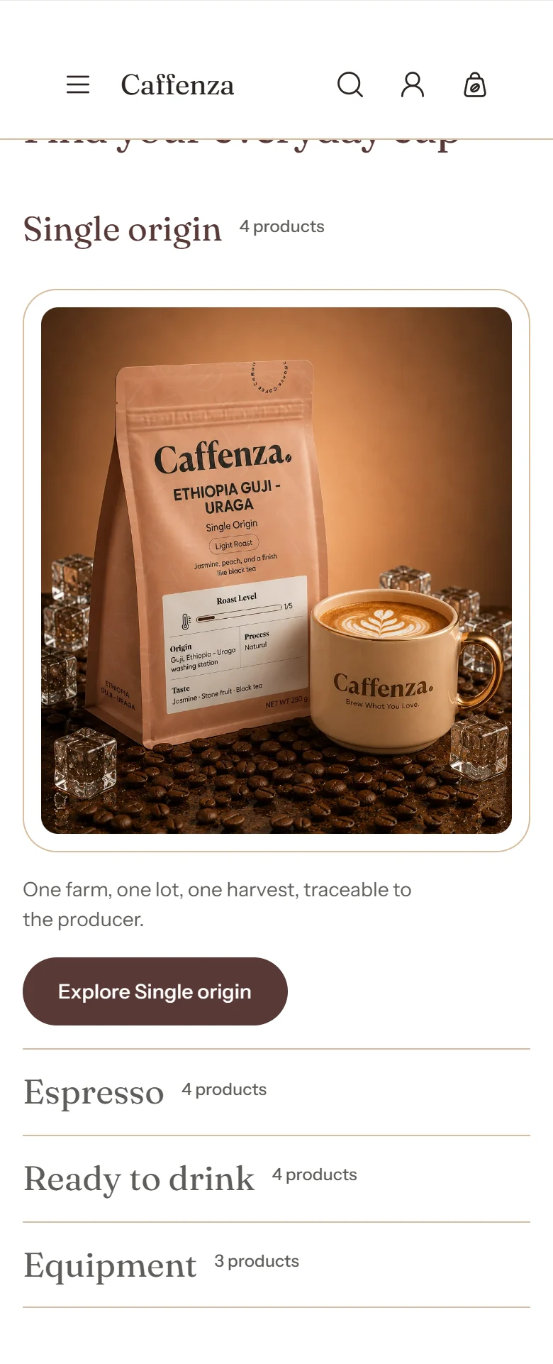
Expandable rows, each opening a collection.
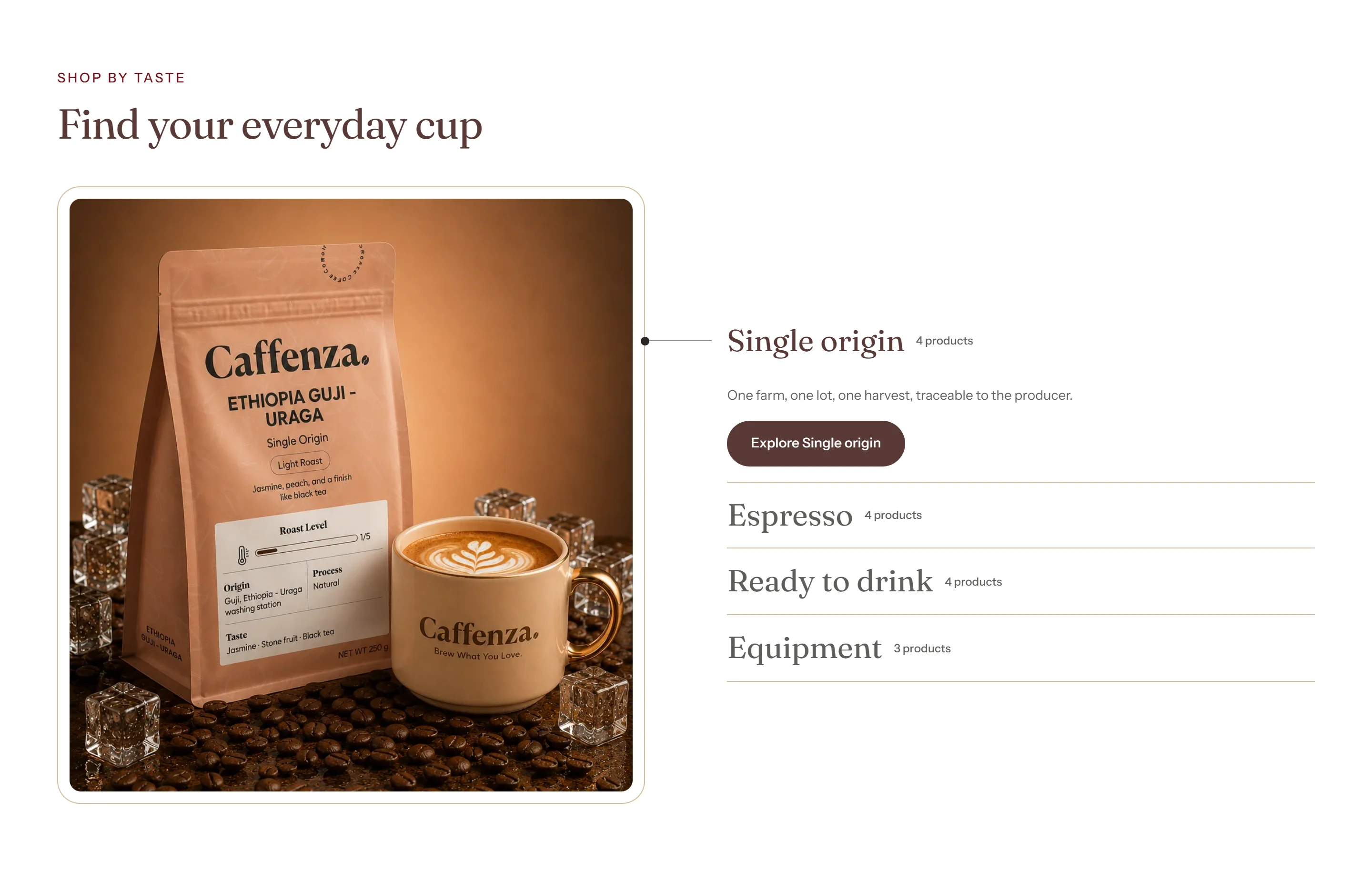
Present your main ranges (Coffee, Tea, Equipment, Gifts) as rows that open with an image and description.
How to add it
- In Shopify admin, go to Online Store → Themes and click Customize.
- Open the page from the page picker at the top of the editor.
- In the sidebar, click Add section and choose Featured collections.
- Fill in the content, then click Save.
Tips
- Add up to 6 collection rows. Choose which one is open when the page loads.
Screenshots
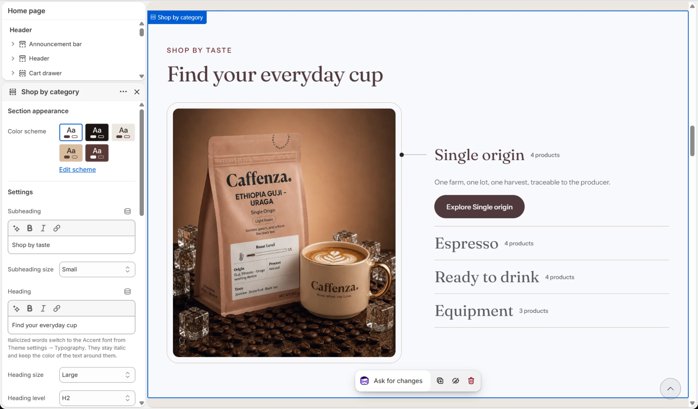
Settings
| Setting | Options | What it does |
|---|---|---|
| Section appearance | ||
| Color scheme | Color scheme | |
| Settings | ||
| Subheading | Text (bold, italic, links) | |
| Subheading size | Small · Medium · Large | |
| Heading | Text (bold, italic, links) | Italicized words switch to the Accent font from Theme settings → Typography. They stay italic and keep the color of the text around them. |
| Heading size | Small · Medium · Large · Extra large | |
| Heading level | H1 · H2 · H3 · H4 · H5 · H6 | Adjust for page structure — one H1 per page. Size is controlled separately. |
| Collection name size | Small · Medium · Large | Larger sizes suit short collection names. Long names wrap onto a second line. |
| Show product count | On / Off | |
| Row open by default | 1–6 | Which row is already open when the section loads. Rows past the last one you added fall back to the first. |
| Prioritize image loading | On / Off | Turn on only when this section is above the fold (visible without scrolling), for example at the top of the home page. Loads its first images immediately instead of when they scroll into view. |
| Button style | Primary · Secondary · Ghost · Link | |
| Button size | Small · Medium · Large | |
| Animations | ||
Blocks
Click Add block under the section in the sidebar. Drag blocks to change their order.
Collection
| Setting | Options | What it does |
|---|---|---|
| Collection | Collection | |
| Image | Image | Optional. Falls back to the collection's own featured image. |
| Heading | Text | Optional. Falls back to the collection's own name. |
| Description | Rich text | Optional. Falls back to the first 160 characters of the collection's own description. |
| Button label | Text | Optional. Defaults to "Explore" followed by the collection name. |
| Link | Link | Optional. Falls back to the collection's own page. |
It also has the shared Animate on scroll and Section spacing settings.