Featured products
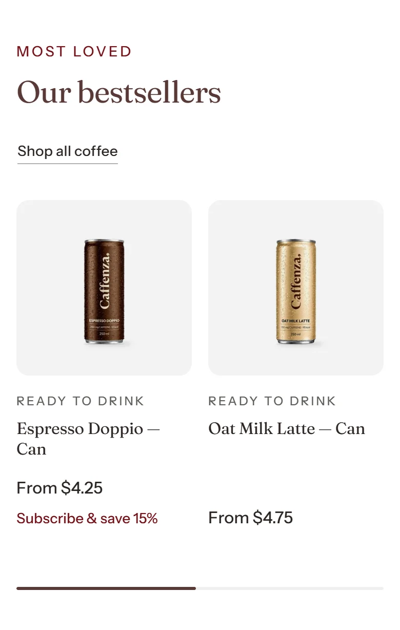
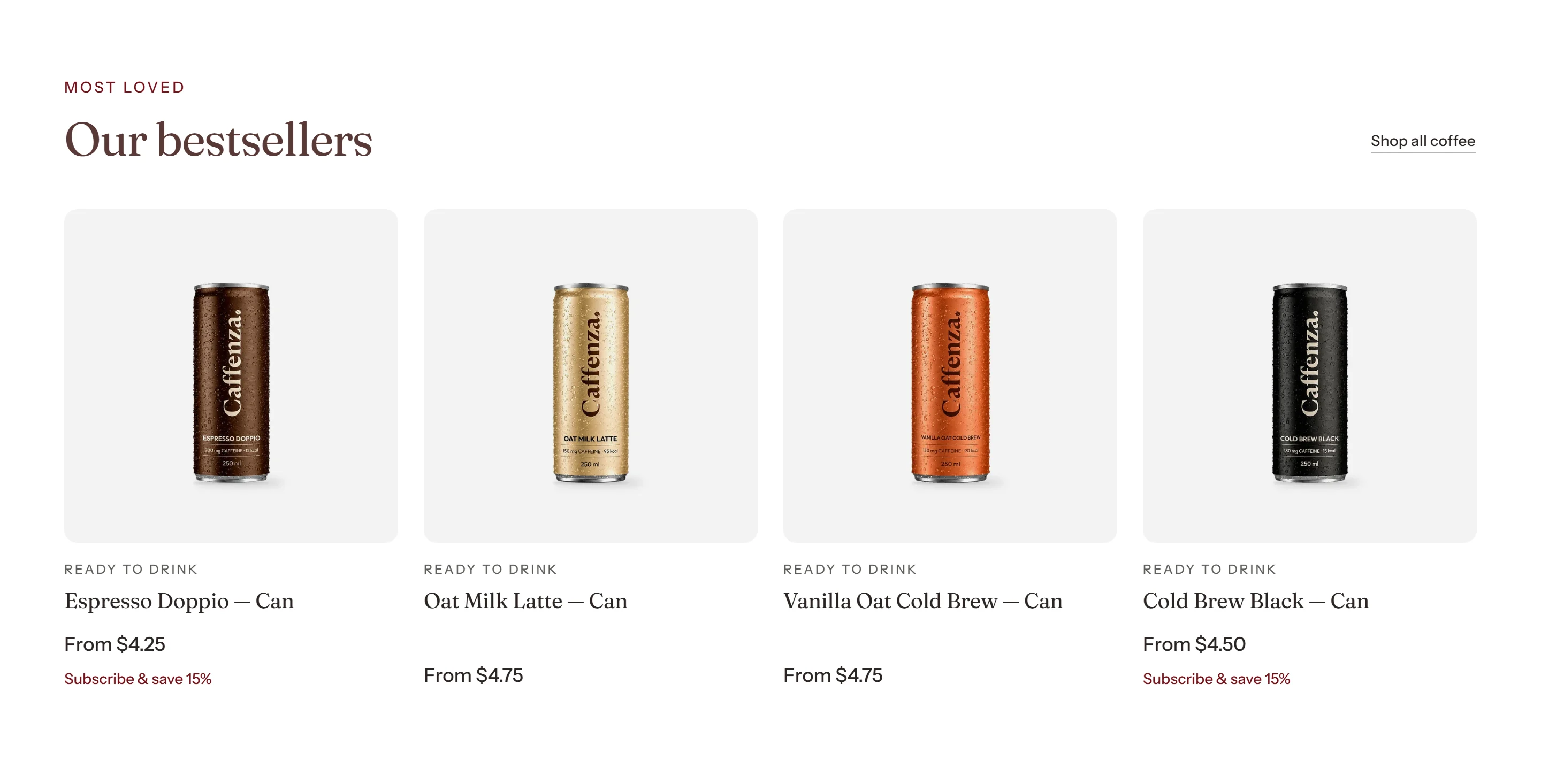
A grid or carousel of products.
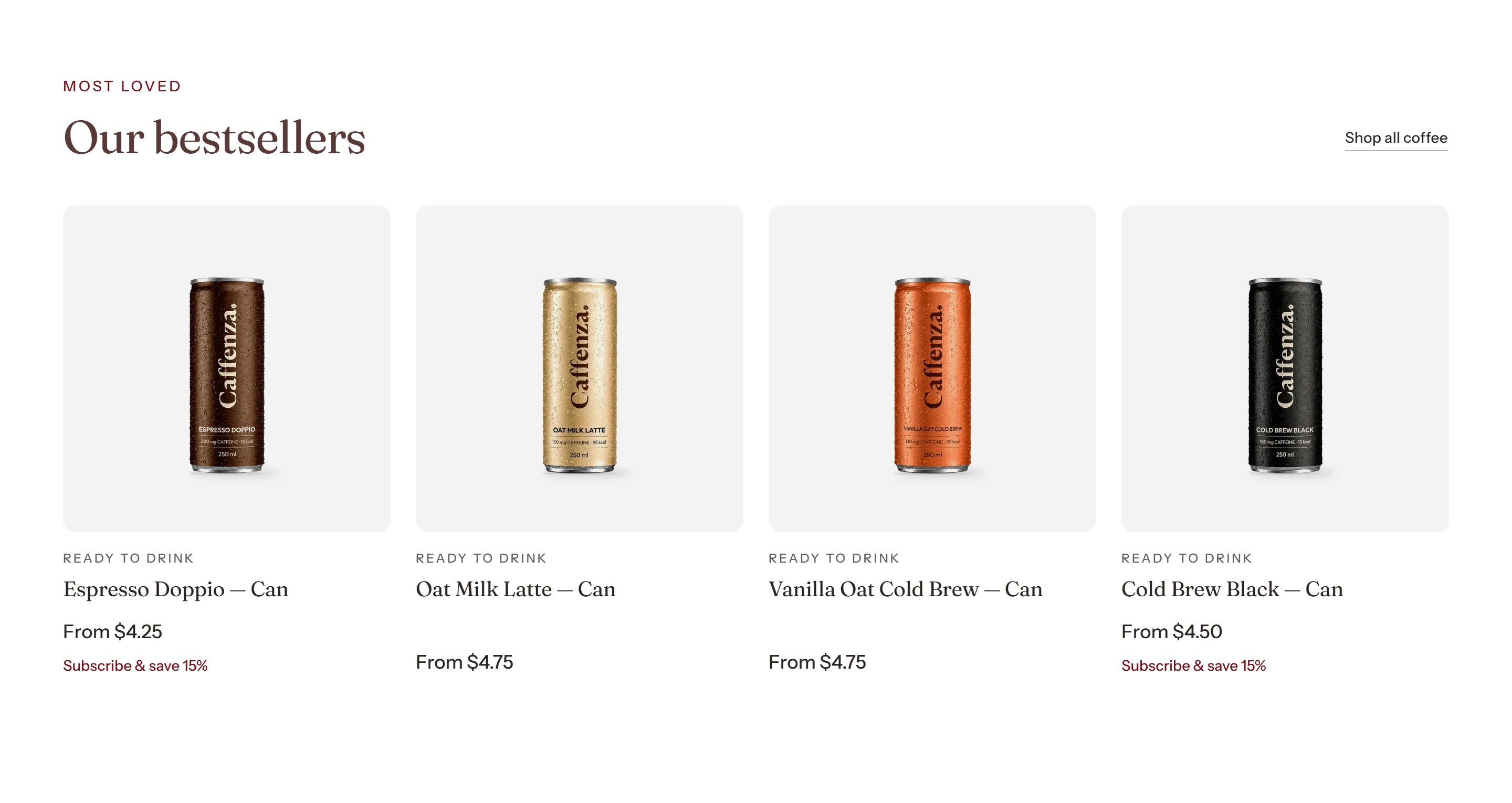
Show bestsellers, new roasts or products from one collection.
How to add it
- In Shopify admin, go to Online Store → Themes and click Customize.
- Open the page from the page picker at the top of the editor.
- In the sidebar, click Add section and choose Featured products.
- Fill in the content, then click Save.
Tips
- Choose “Recommended for this product” on product pages for automatic recommendations.
- Pick a card style: Simple, Brew specs or Pairs with. See Product cards.
Screenshots
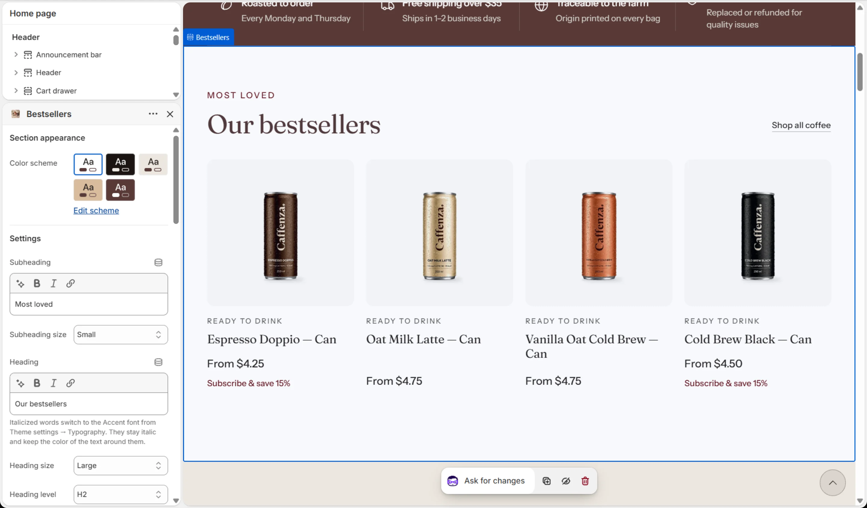
Settings
| Setting | Options | What it does |
|---|---|---|
| Section appearance | ||
| Color scheme | Color scheme | |
| Settings | ||
| Subheading | Text (bold, italic, links) | |
| Subheading size | Small · Medium · Large | |
| Heading | Text (bold, italic, links) | Italicized words switch to the Accent font from Theme settings → Typography. They stay italic and keep the color of the text around them. |
| Heading size | Small · Medium · Large · Extra large | |
| Heading level | H1 · H2 · H3 · H4 · H5 · H6 | Adjust for page structure — one H1 per page. Size is controlled separately. |
| Products | ||
| Products from | A collection · Selected products · Recommended for this product | |
| Collection | Collection | Used when "Products from" is set to A collection. |
| Number of products to show | 2–12 | |
| Products | Products | Used when "Products from" is set to Selected products. They appear in the order you arrange them here. |
| Card style | Simple · Brew specs · Pairs with | "Simple" shows one detail line, the price and the level meter. "Brew specs" adds the spec cells set in Theme settings. "Pairs with" shows the companion product. |
| Layout | ||
| Layout | Carousel · Grid | |
| Columns on desktop | 2–5 | |
| Columns on mobile | 1 · 2 | |
| Prioritize image loading | On / Off | Turn on only when this section is above the fold (visible without scrolling), for example at the top of the home page. Loads its first images immediately instead of when they scroll into view. |
| Carousel | ||
| Show previous/next arrows | On / Off | |
| Pagination style | Progress bar · Counter with line · Dots · Counter · None | |
| Control alignment | Left · Center · Right | Aligns the dots, counter or arrows under the slides. |
| Loop slides | On / Off | |
| Buttons | ||
| Button label | Text | Leave empty to hide the button. |
| Link | Link | Leave empty to link to all products. |
| Button style | Primary · Secondary · Ghost · Link | |
| Button size | Small · Medium · Large | |
| Animations | ||
It also has the shared Animate on scroll and Section spacing settings.