Collapsible content (FAQ)
Questions and answers, with topics, tabs and search.
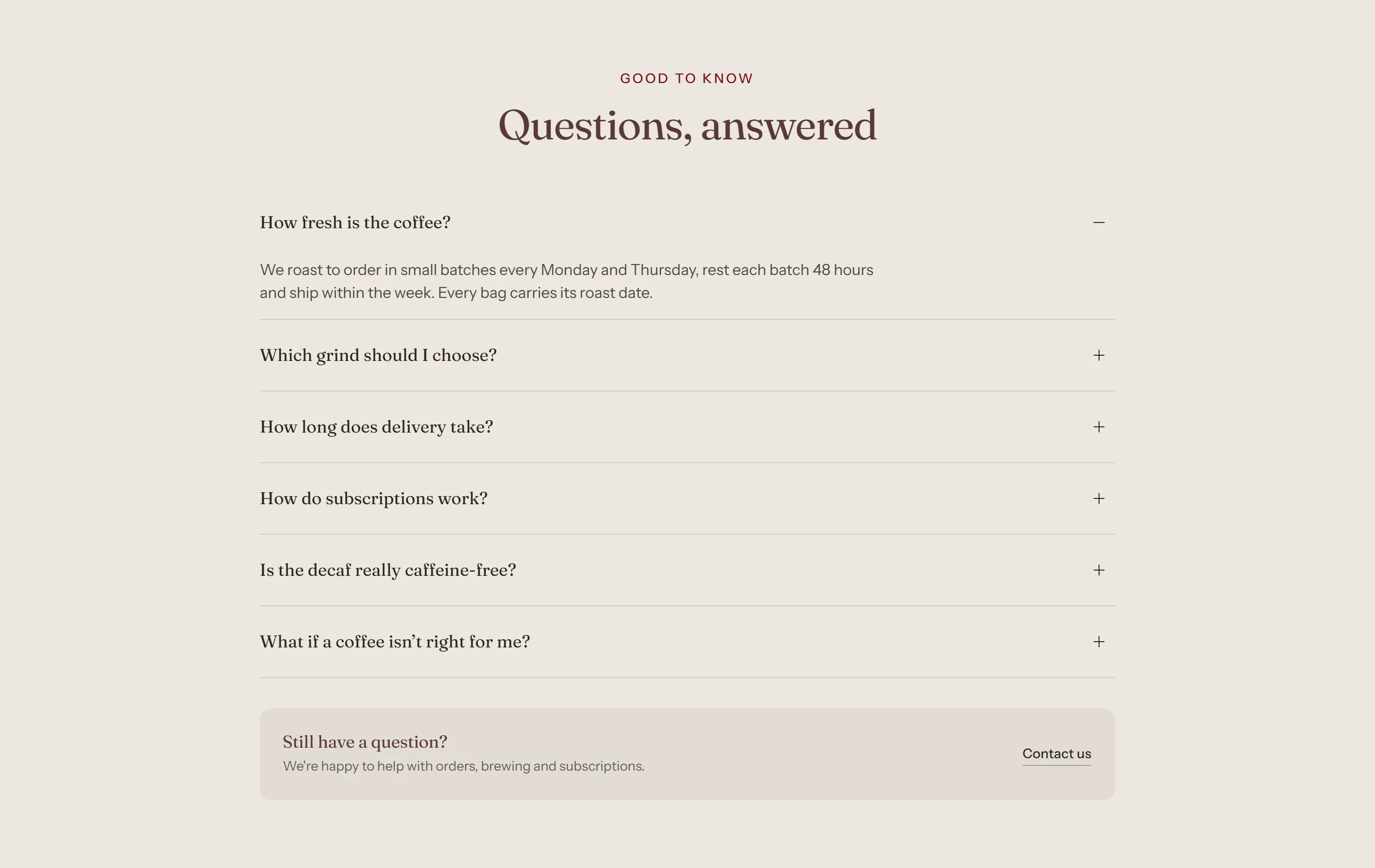
Answer questions about shipping, freshness, grind size and subscriptions.
How to add it
- In Shopify admin, go to Online Store → Themes and click Customize.
- Open the page from the page picker at the top of the editor.
- In the sidebar, click Add section and choose Collapsible content.
- Fill in the content, then click Save.
Tips
- Give questions a Category to group them into tabs.
- Turn on FAQ structured data on only one FAQ section per page.
Screenshots
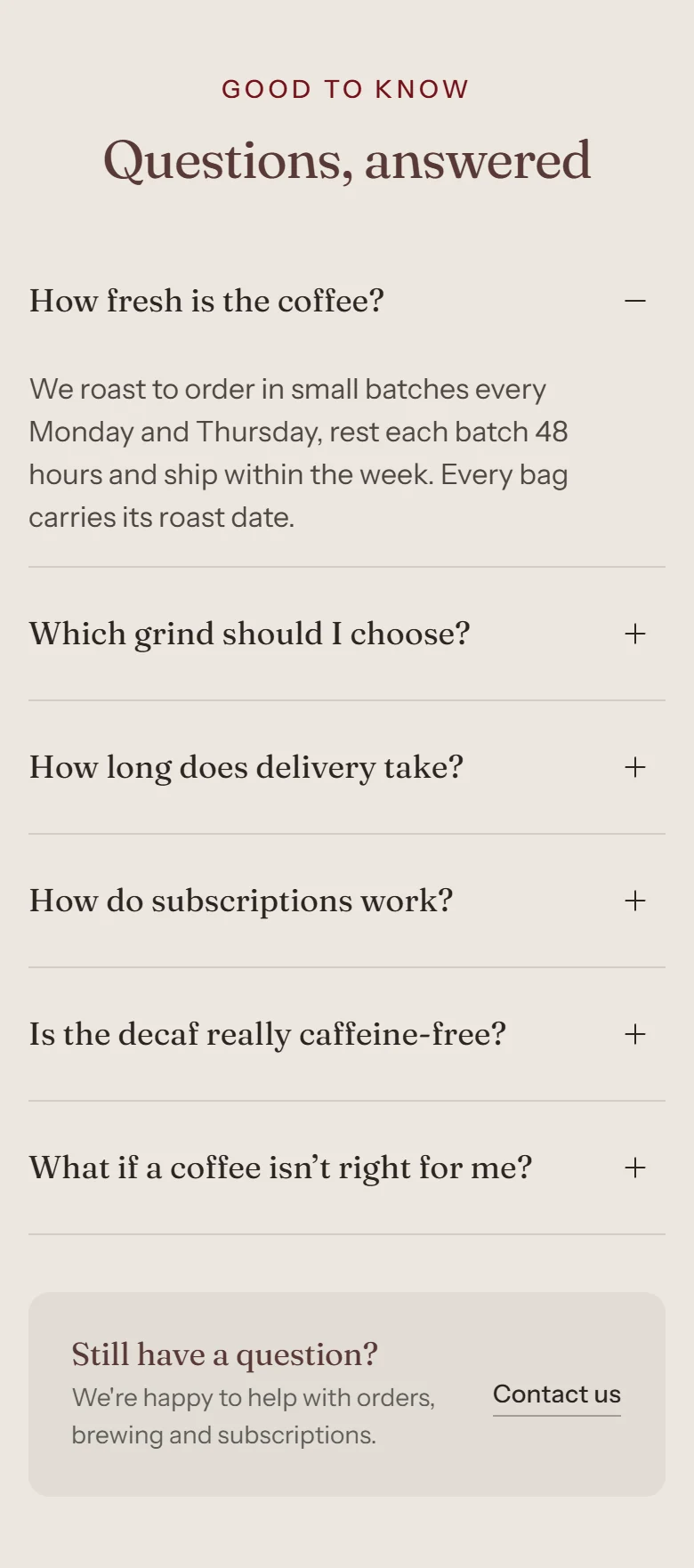
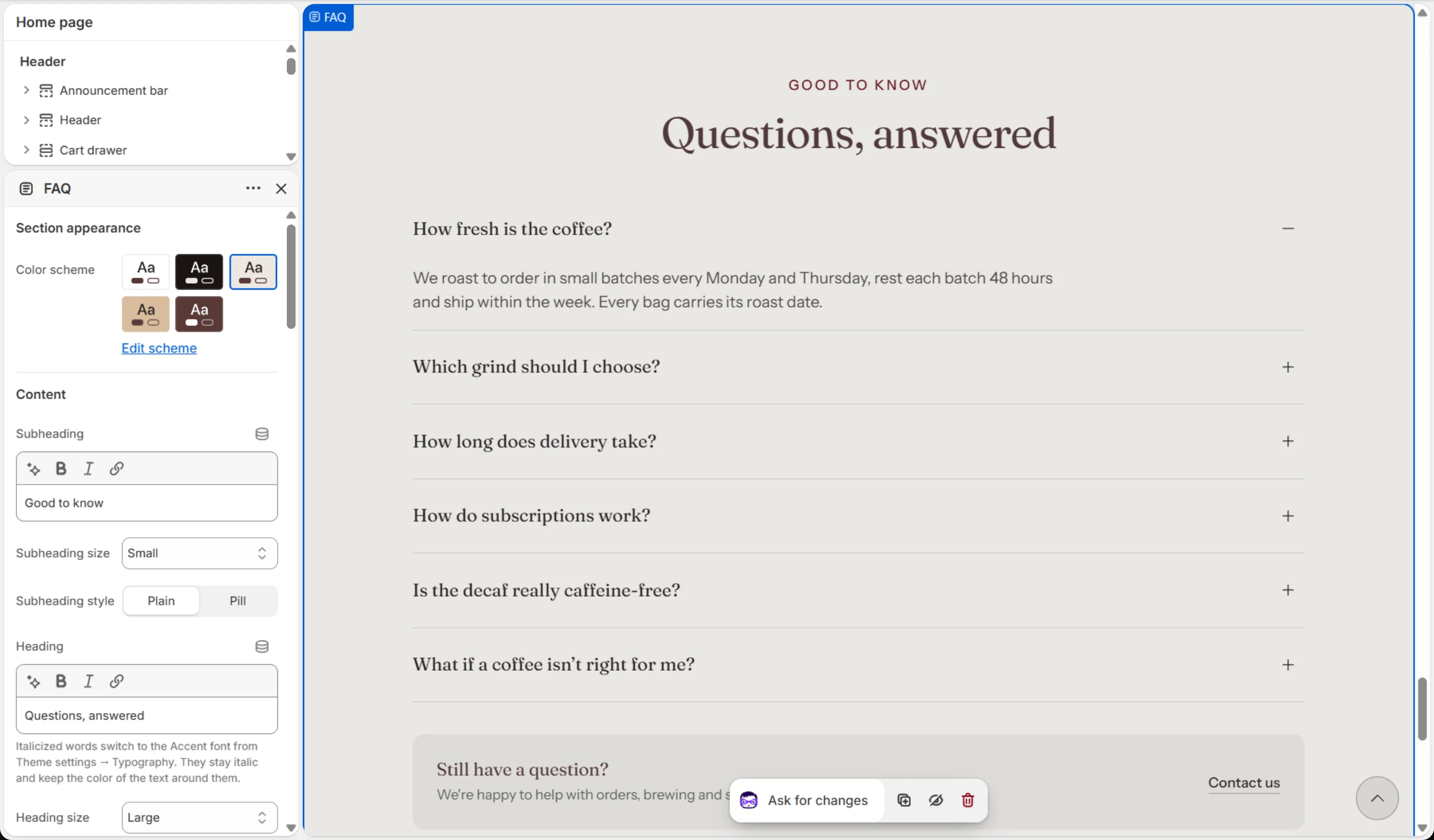
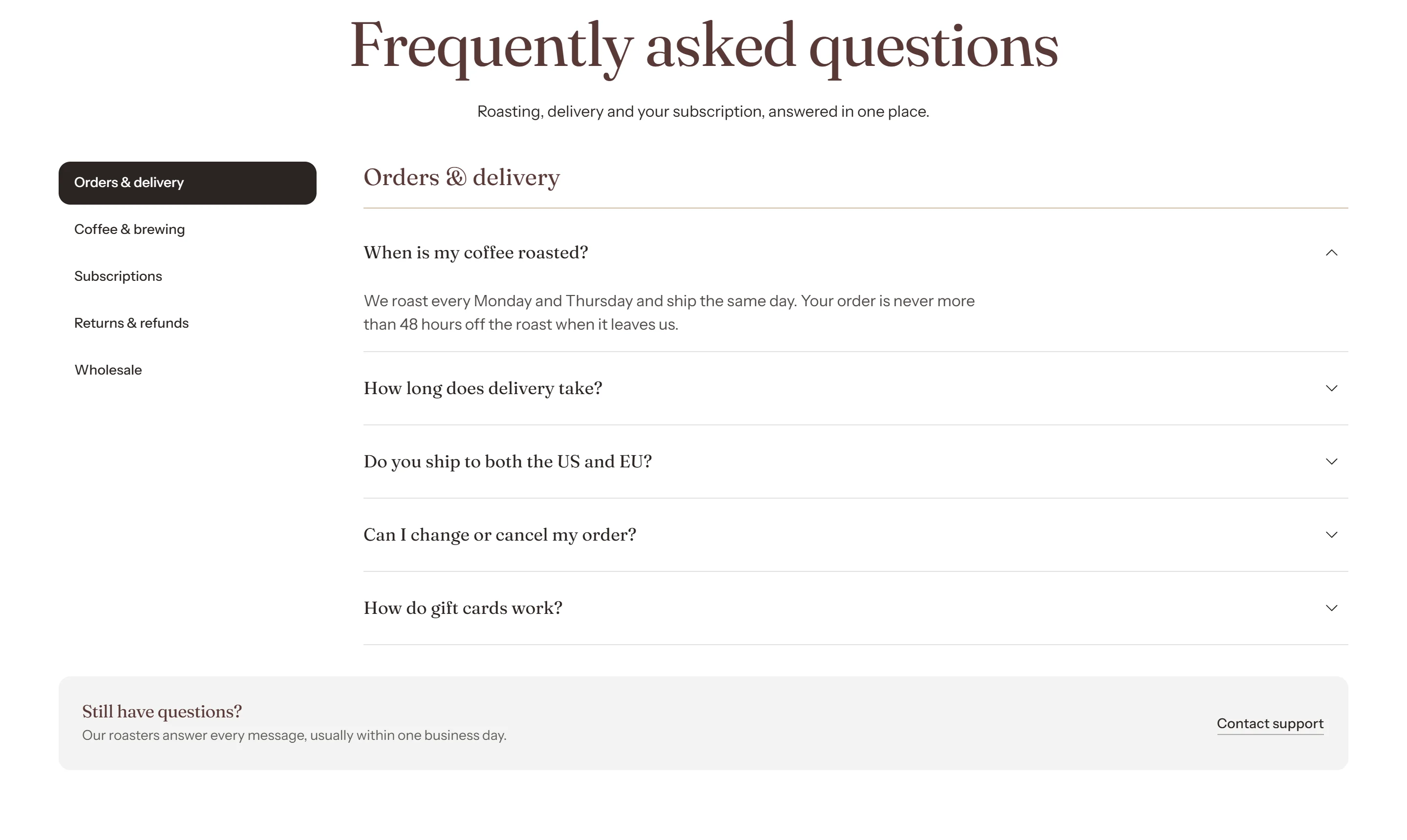
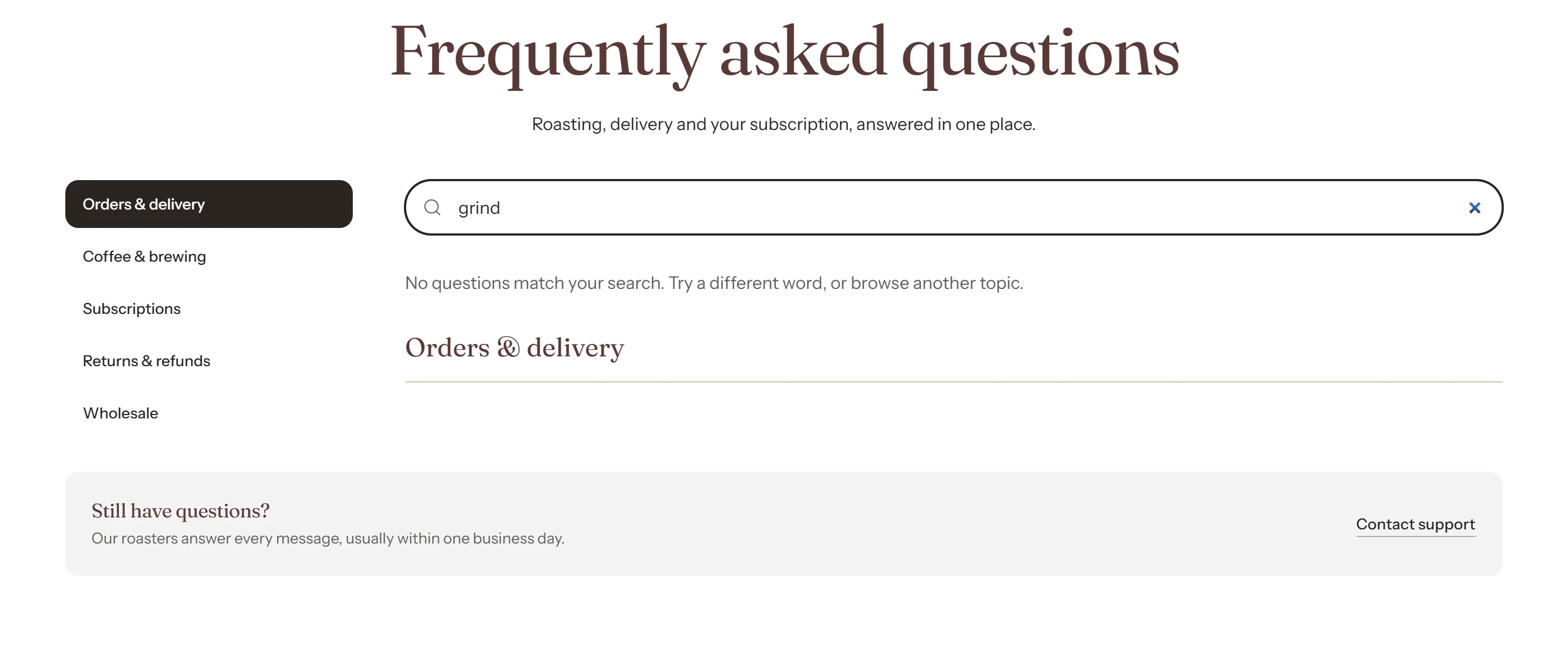

Settings
| Setting | Options | What it does |
|---|---|---|
| Section appearance | ||
| Color scheme | Color scheme | |
| Content | ||
| Subheading | Text (bold, italic, links) | |
| Subheading size | Small · Medium · Large | |
| Subheading style | Plain · Pill | |
| Heading | Text (bold, italic, links) | Italicized words switch to the Accent font from Theme settings → Typography. They stay italic and keep the color of the text around them. |
| Heading size | Small · Medium · Large · Extra large | |
| Heading level | H1 · H2 · H3 · H4 · H5 · H6 | Adjust for page structure — one H1 per page. Size is controlled separately. |
| Text | Rich text | |
| Text size | Small · Medium · Large | |
| Content alignment | Left · Center | |
| Topics and tabs | ||
| Topic list heading | Text | Sits above the topic list. Read out to screen readers even when hidden. |
| Show topic list heading | On / Off | |
| Show question count | On / Off | |
| Add an "All" tab | On / Off | Adds a tab that shows every question at once. The first topic stays selected on load. |
| "All" tab label | Text | |
| Show search | On / Off | Filters questions inside the selected tab as the shopper types. Needs JavaScript, so it is hidden if scripts are blocked. |
| Layout | ||
| Layout | Centered list (no topics) · Topics on the left · Topics on the right · Topics above · Topic index (every topic on one page) | The topic list moves above the questions on mobile, whichever layout you choose. |
| Topic list width | 20–40 % | |
| Accordion | ||
| Allow several answers open at once | On / Off | |
| Open the first question in each topic | On / Off | In the topic index layout, every topic shows at once, so only the first question on the page opens. |
| Open and close icon | Plus and minus · Chevron · None | |
| Icon position | Before the question · After the question | |
| Icon color | Color scheme | The open and closed icon use this color scheme's background and text colors, so the symbol is always readable. |
| Question separator | Line · Card · None | |
| Support bar | ||
| Show support bar | On / Off | A "still have questions" bar under the list, with a contact button. Turn it off to hide it entirely. |
| Icon | None · Headset · Envelope · Coffee cup · Coffee bean | |
| Heading | Text (bold, italic, links) | |
| Text | Text | |
| Button label | Text | |
| Link | Link | |
| Button style | Primary · Secondary · Ghost · Link | Secondary is outlined, and stands out best against the tinted bar on every color scheme. |
| Button size | Small · Medium · Large | |
| Open in a new tab | On / Off | |
| SEO and performance | ||
| Add FAQ structured data | On / Off | Helps search engines and AI assistants read your answers. Turn this on for only ONE collapsible content section per page — a page with two sets of FAQ data is ignored. |
| Animations | ||
Blocks
Click Add block under the section in the sidebar. Drag blocks to change their order.
Question
| Setting | Options | What it does |
|---|---|---|
| Category | Text | Questions with the same category share a tab. Capitalization and spacing are ignored when matching, and the first question in each group sets the label shown. |
| Question | Text | |
| Answer | Rich text | |
| Badge | Text | Optional short label beside the question, for example "New" or "Popular". |
| Link | ||
| Link text | Text | |
| Link | Link | |
| Open in a new tab | On / Off | |
This section also accepts Custom Liquid blocks and app blocks. It also has the shared Animate on scroll and Section spacing settings.