


12 Proven Tips to Optimize Shopify Store for Mobile in 2026
 Gaurav Jat

Summarize this blog post with:
Overview
Shopify mobile optimization is the process of improving your store for smartphones and tablets across five areas: page speed, responsive design, navigation, images, and checkout.
The goal is not a prettier phone layout. It is closing the gap between how much traffic arrives on mobile and how little of it converts.
This guide covers how to audit your store, what to fix first, the Core Web Vitals targets that matter in 2026, and what experienced Shopify merchants say actually works.
Introduction
Most people who visit your Shopify store are holding a phone.Roughly 78% of eCommerce traffic now comes from mobile devices, and mobile accounts for close to 59% of global retail eCommerce sales.
Here is the problem. Mobile brings the traffic, but desktop still closes the sale.
Industry benchmarks put desktop conversion around 3.5% to 3.9%, while mobile sits closer to 1.8% to 2.3%.
On Shopify specifically, reported averages land near 1.2% mobile against 1.9% desktop.
That gap is not a customer problem. It is a friction problem, and almost all of it is fixable.
Pro Tip
Want the broader numbers first? See our roundup of current Shopify statistics.
Audit First Before Optimizing Shopify Store: Find Out Where You Actually Stand
Do not start redesigning. Start measuring.
Most stores have three or four specific problems, not fifty. An audit tells you which ones are costing you money.
Step 1: Split Your Analytics by Device
In Shopify Analytics, compare mobile against desktop on four numbers: sessions, bounce rate, conversion rate, and average order value.
Then break it down by landing page and traffic source. Paid social visitors behave differently from organic visitors, and lumping them together hides the real problem.
Step 2: Run Your Three Money Pages Through Speed Tools
Test your homepage, your best-selling product page, and your cart.
These three drive most of your revenue, so fixes here pay back fastest.
- Google PageSpeed Insights. Gives you field data from real Chrome users plus lab diagnostics.
- Lighthouse in Chrome DevTools. Run it in mobile mode with network throttling on, not on your office wifi.
- Shopify’s Online Store Speed Report. Found in your admin, it benchmarks you against comparable Shopify stores.
- Shopify App Speed Report. Shows which installed apps are adding load time to which pages.
Do not chase a perfect score. Look for the specific blockers: oversized images, unused scripts, render-blocking CSS, and heavy third-party app embeds.
Step 3: Know Your Core Web Vitals Targets
These are the thresholds Google considers “good” on mobile:
- Largest Contentful Paint (LCP): under 2.5 seconds.
- Interaction to Next Paint (INP): under 200 milliseconds. INP replaced First Input Delay in March 2024, so if your notes still reference FID, they are out of date.
- Cumulative Layout Shift (CLS): under 0.1.
CLS is the one most Shopify stores fail without realising. It happens when a banner, review widget, or cookie bar loads late and pushes the Add to Cart button down just as the shopper reaches for it.
12 Best Tips to Optimize Your Shopify Store for Mobile
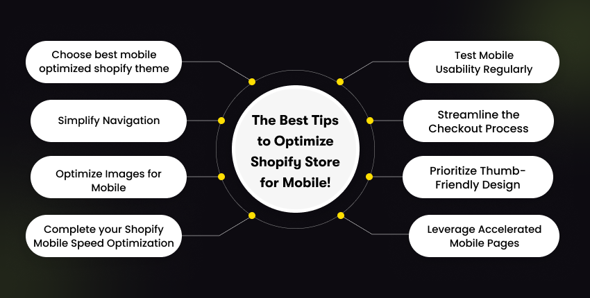
1. Start With a Genuinely Fast Theme
Your theme sets the performance ceiling. No app can rescue a bloated one.
Look for a theme built mobile-first rather than a desktop layout that shrinks. Preview it on a real phone, not just the theme editor.
Browse our picks for the fastest Shopify themes and the broader list of best Shopify themes if you are still choosing.
Pro Tip
Resist loading a fast theme with sliders, animation libraries, and video backgrounds. Every one of them gives back the speed you just bought.
2. Design for Thumbs, Not Cursors
Mobile shoppers scroll far more than they click. Your job is to make the few taps they do make effortless.
- Keep tap targets at least 44 x 44 pixels, with clear space between them.
- Put the primary CTA where a thumb naturally rests, which is the lower half of the screen.
- Use a sticky Add to Cart bar on product pages so the buy action never scrolls out of reach.
- Allow one primary action per screen. Two competing buttons means neither gets tapped.
3. Simplify Navigation Ruthlessly
Long drop-down menus that work fine with a mouse become a maze on a 6-inch screen.
- Use a hamburger menu with your top categories only, and keep it two levels deep at most.
- Add a sticky header carrying search and cart so they are always one tap away.
- Make search prominent with autocomplete. Mobile users search rather than browse because typing beats scrolling.
- Use short, literal category labels. Clever naming costs you clicks.
4. Control Your Vertical Space
This tip comes from merchants rather than theory.
A common approach shared in the Shopify Community is to design each homepage section to occupy roughly 80% of the viewport height, so the next section peeks into view and signals there is more below.
Anything that will not fit vertically becomes a horizontal swipe carousel, capped at five or six items.
It keeps the homepage short enough to finish and long enough to explore.
5. Fix Image Weight Before Anything Else
Images are usually the single heaviest thing on a Shopify page. That makes them the fastest win available to you.
- Compress every image before upload. Serve WebP or AVIF where your theme supports it.
- Use responsive images with srcset so phones download a phone-sized file, not a desktop hero.
- Keep consistent aspect ratios across a collection so grids do not jump as they load.
- Always set explicit width and height attributes. This alone prevents most layout shift.
- Lazy load everything below the fold, but never lazy load your LCP image. Doing so makes your score worse, not better.
6. Cut Script and App Bloat
Every app you install injects JavaScript and CSS that runs on every page load. That includes pages where the app does nothing at all.
- Audit your installed apps quarterly and uninstall anything you are not actively using.
- Check that uninstalling actually removed the leftover theme code. It often does not.
- Consolidate. One app doing three jobs beats three apps doing one each.
- Defer non-critical scripts such as chat widgets, review carousels, and trackers so they load after the main content.
Our list of the best Shopify plugins flags the lightweight options worth keeping.
7. Eliminate Render-Blocking Resources
Render-blocking CSS and JavaScript force the browser to wait before it can paint anything.
On a mid-range Android over 4G, that wait is where you lose people.
- Identify blockers in the PageSpeed Insights opportunities section.
- Inline critical CSS for above-the-fold content and defer the rest.
- Add async or defer attributes to non-essential scripts.
- Preload your hero image and primary web font so they arrive early.
- Limit custom fonts to two weights. Each additional weight is another blocking download.
8. Reduce Redirect Chains
Every redirect is an extra round trip, and round trips cost more on mobile networks than on wifi. Audit your URL structure after any migration, collection rename, or product URL change.
Old chains accumulate silently, and nobody notices until a speed audit surfaces them.
9. Streamline the Mobile Checkout
Checkout is where mobile loses most decisively to desktop. Typing an address on a phone is genuinely unpleasant, and every extra field makes it worse.
- Enable guest checkout. Forced account creation is a top abandonment cause.
- Turn on wallet payments: Shop Pay, Apple Pay, Google Pay, PayPal. These skip form-filling entirely.
- Use Shopify’s one-page checkout and address autofill.
- Show total cost including shipping as early as possible. Surprise fees at the final step kill carts.
- Use the correct input types so phones show a number pad for card fields instead of a full keyboard.
For the payments side of that setup, see the benefits of Shopify Payments.
10. Handle Pop-Ups Carefully
Pop-ups convert, but an overlay that covers the whole screen on arrival is an intrusive interstitial.
Google has penalised those on mobile for years.
- Trigger on exit intent or scroll depth, never on page load.
- Use slide-ins or bottom banners instead of full-screen overlays.
- Make the close button large and obvious. A tiny X is a bounce waiting to happen.
11. Make Text Actually Readable
If a visitor has to pinch to zoom, you have already lost the sale.
- Body text at 16px minimum, headings at 20px to 24px on mobile.
- Strong contrast between text and background.
- Short paragraphs. Break long product descriptions into bullets and collapsible sections.
- Put price, rating, and Add to Cart above the fold on product pages. Description below.
12. Test on Real Devices, Not Just the Editor
The theme editor’s mobile preview lies.
It does not simulate slow processors, patchy networks, or how a real thumb behaves.
- Test on both iOS and Android, and on at least one older mid-range device.
- Throttle to 4G in Chrome DevTools to see what a real shopper experiences.
- Use a cross-browser tool such as BrowserStack for device coverage you do not own.
- Complete a full purchase on your phone yourself, at least once a month.
Merchants in a Shopify Community discussion on mobile optimization keep landing on the same habit: test your own store on your own phone, regularly.
If anything feels annoying or slow to you, it is worse for a first-time visitor. A practical fix raised in a Shopify Community thread on mobile responsiveness: if you have custom CSS, check for fixed pixel widths.
Replacing hard-coded widths with percentages, viewport units, or max-width fixes a large share of alignment and overflow issues on small screens. Best of all, it does so without touching the rest of your theme.
Final Thoughts
Mobile optimization is not a design refresh, and it is not a one-time project.
It is the work of closing the gap between the traffic your phone visitors represent and the revenue they currently produce.
Audit before you build. Fix images and app bloat before you touch the theme, and measure with Core Web Vitals rather than opinions.
Once speed is handled, the next lever is conversion itself. Our guides on Shopify CRO best practices and improving Shopify conversion rate without increasing ad spend pick up where this one ends.
Then keep it up. Put a twenty-minute check in the calendar each month: run PageSpeed Insights on your three money pages, review the App Speed Report, and buy something on your own phone.
It is also worth tracking current Shopify trends, since checkout and theme capabilities shift with each Shopify edition release.
If this feels like more than you want to take on, we can handle it end to end.
Hire Dedicated Shopify Developers
Our Shopify team works on theme performance, Core Web Vitals, and checkout optimization every week. We are happy to start with a straight audit so you know exactly what is costing you conversions.
Book Your Free Consultation Call
Frequently Asked Questions (FAQs)
How do I check if my Shopify store is mobile-friendly?
Run your homepage, top product page, and cart through Google PageSpeed Insights in mobile mode, then check the Online Store Speed Report in your Shopify admin.
Follow up by browsing and completing a test purchase on a real phone over mobile data rather than wifi.
What is a good mobile page speed for a Shopify store?
Target the Core Web Vitals thresholds: LCP under 2.5 seconds, INP under 200 milliseconds, and CLS under 0.1.
Those matter more than the composite Lighthouse score, which fluctuates between runs and is easy to over-optimise for.
Why is my Shopify mobile speed score so much lower than desktop?
Mobile tests simulate a slower processor and a throttled network, so the same page genuinely takes longer to render.
Beyond that, the usual culprits are desktop-sized images served to phones, too many app scripts, and render-blocking CSS or fonts.
Do Shopify speed optimization apps actually work?
They help with specific jobs like image compression, lazy loading, and script deferral.
They cannot fix a heavy theme or an over-installed store, and each app adds its own overhead. Audit and remove first, then add an optimization app if gaps remain.
Should I still use AMP for my Shopify store in 2026?
No. Google dropped the AMP requirement for Top Stories in 2021 and now evaluates page experience through Core Web Vitals on your normal pages.
Most Shopify AMP apps are discontinued. Invest that effort in theme performance instead.
Does mobile optimization affect my Google rankings?
Yes. Google crawls and indexes with a smartphone user agent, so the mobile version of your page is the version being assessed.
Core Web Vitals feed into page experience signals, and faster pages also reduce bounce, which supports rankings indirectly.
How often should I test my Shopify store’s mobile performance?
Monthly as a baseline, and immediately after installing an app, changing your theme, or launching a campaign with new creative assets.
Most performance regressions trace back to a change made in the previous few weeks.

- Recover Lost Sales
- Boost Conversions
- Reduce Abandonment
- Faster Store
📘 FREE REPORT
The Shopify Revenue Leaks Report
Discover the hidden mistakes silently costing Shopify stores thousands every month—and learn exactly how to fix them.
Instant access • No spam • Unsubscribe anytime.