


12 Micro-Interactions Worth Building in 2026 (With Visual Examples)
 Vaishali Pitroda
Summarize this blog post with:
TL;DR
Micro-interactions are the small feedback moments that answer one question for the user: did that work?
In 2026 the ones that matter most are AI streaming states, skeleton screens, optimistic UI, scroll-driven animation, and native view transitions.
Keep them between 150 and 300 milliseconds, and always respect reduced-motion settings.
Introduction
When a micro-interaction is missing, nothing visibly breaks. There is no error message.
The user just quietly trusts your product a little less, and neither you nor your analytics dashboard ever finds out why.
That is what makes these details worth getting right. A button that does not respond, a form that stays silent until submit, an upload with no progress bar: none of them throw an error, and all of them cost you users.
This guide covers what micro-interactions actually do, the ones worth building in 2026, and the timing and accessibility rules that separate the useful ones from decoration.
What Are Micro-Interaction Designs?
A micro-interaction is a small, contained moment that connects a user action to a system response.
That could be a button that ripples, a bar that fills, a dot that pulses, or a field that turns green as you type.
The term comes from Dan Saffer, whose book remains the reference text on the subject. His framing is worth keeping in mind before you build anything:
Microinteractions are an exercise in restraint, in doing as much as possible with as little as possible. Embrace the constraints and focus your attention on doing one thing well.
Users who describe a product as “intuitive” are usually responding to dozens of these moments removing uncertainty at every step.
They never consciously notice a single one. That is the point. Getting them right also means avoiding the more obvious pitfalls, which we cover in Top 10 Mistakes in Web Design That Are Costing You Users.
Best Micro-Interactions for Websites in 2026
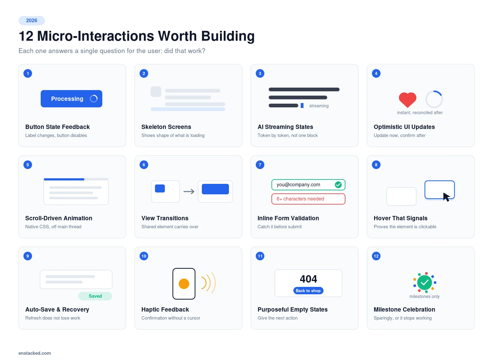
Infographic listing 12 micro-interaction examples for websites in 2026, including button state feedback, skeleton screens, AI streaming states and optimistic UI updates.
1. Button State Feedback
Without a response, users assume the click missed and click again. On a payment button, that means duplicate orders and support tickets.
Change the label, not just the colour. A checkout button that shifts to “Processing…” and disables itself tells the user exactly what is happening and blocks the double-submit at the same time.
2. Skeleton Screens Instead of Spinners
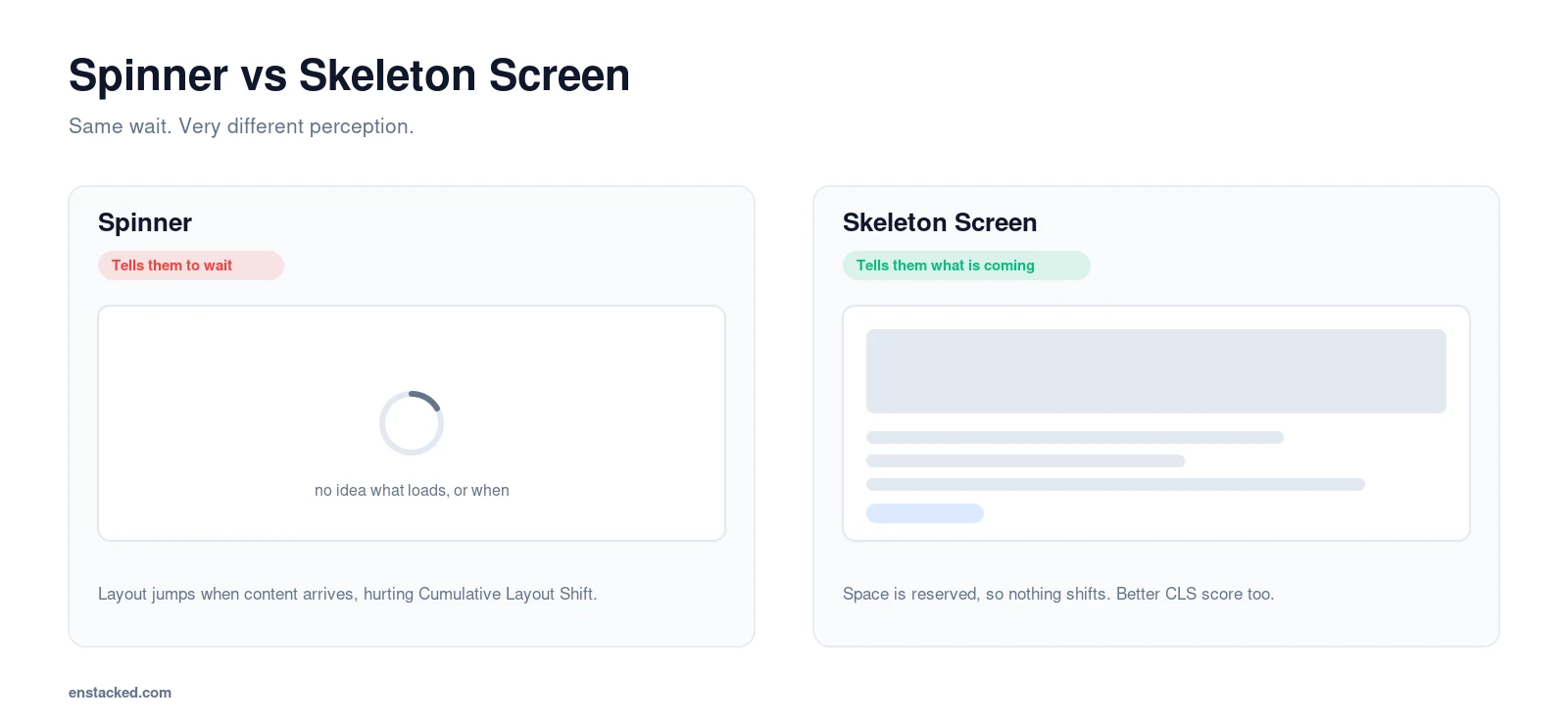
A spinner tells the user to wait. A skeleton screen tells them what is coming, which makes the same wait feel shorter.
The Nielsen Norman Group lists visibility of system status as one of the most frequently violated usability heuristics, and loading states are where most products break it.
Grey placeholder blocks shaped like the content that is loading also reserve the space, so nothing jumps when the real content arrives. That fixes your Cumulative Layout Shift score at the same time.
This is the modern replacement for the old blurred-image-loading trick. Same idea, better execution.
3. AI Streaming and Thinking States
Any interface with an AI feature has a wait problem. Generation takes seconds, and seconds of silence feel like a crash.
Stream the response token by token rather than delivering it in one block. Users start reading immediately, so perceived latency drops even though total time does not change.
For longer operations, show what the system is actually doing: “Searching your documents,” then “Drafting a summary.” A named step reassures far better than a generic shimmer.
4. Optimistic UI Updates
Instead of waiting for the server to confirm, update the interface immediately and reconcile in the background.
Tap a like and the heart fills instantly, even though the request is still in flight. If it fails, quietly revert and show a message.
This is why native apps feel faster than web apps. Often they are not faster, they just stop making you wait to see your own action.
5. Scroll-Driven Animation
Reading progress bars and elements that fade in as they enter the viewport used to require JavaScript and an IntersectionObserver.
CSS scroll-driven animations now handle this natively with animation-timeline, which means the animation runs off the main thread and stays smooth even on mid-range phones.
A reading progress bar also gives the user a sense of how much is left, which makes long pages feel finishable rather than endless.
6. View Transitions Between Pages
Clicking a link and staring at a white flash breaks the sense of continuity. The View Transitions API lets one page morph into the next.
The strongest use is a shared element. Tap a product thumbnail in a grid and that same image expands into the product page hero, so the user never loses their place.
Also read: Adaptive vs Responsive Design
7. Inline Form Validation
Filling a form, hitting submit, and getting a generic “Error” forces the user to guess what went wrong. Many just leave.
Validate as they type. Password rules that resolve one by one, an email field that confirms format on blur, a card field that detects the card type from the first four digits.
Validate on blur rather than on every keystroke. Telling someone their email is invalid while they are still typing it is worse than saying nothing.
8. Hover States That Signal Interactivity
In dense layouts, users hesitate over elements they are not sure are clickable, or rage-click ones that are not.
A card that lifts slightly or drifts toward the cursor confirms it is interactive without needing a label or a colour change.
Remember this does not exist on touch. Never make a hover state the only way to discover a function.
9. Auto-Save and Session Recovery
A user spends five minutes on a form, refreshes by accident, and loses everything. That lead is gone.
Persist form state to local storage as they type, and restore it on return. Do the same for carts and filter selections.
Say so, too. A quiet “Saved” that appears and fades is what turns the feature from invisible into reassuring.
10. Haptic Feedback on Mobile
On touch there is no cursor and no hover, so confirmation has to come from somewhere else. A short vibration on tap does the job.
Use the Vibration API sparingly and keep it to genuinely meaningful actions: added to cart, payment confirmed, item deleted.
Buzzing on every tap is worse than no haptics at all, and users will disable it.
11. Purposeful Empty and Error States
An empty cart, a search with no results, or a 404 is a moment where most products default to a shrug.
It is also a moment where the user needs direction most. Pair the message with one clear next action rather than an apology.
Dribbble is the reference example here. Its 404 page builds the error code out of cutouts of the platform’s best design work, turning a dead end into a showcase for exactly the audience that would appreciate it.
12. Milestone Celebrations, Used Sparingly
Mailchimp confirms a scheduled campaign with its “Rock On!” animation rather than a flat success message. Writing a newsletter is real work, and the moment gets treated as such.
The discipline is in the sequencing. Celebrate genuine milestones only. Confetti after every completed field trains users to ignore your feedback entirely, including the feedback that matters later.
Micro-Interaction Timing: The Numbers That Actually Matter
Most bad micro-interactions are not badly designed. They are badly timed.
Google’s Material Design 3 easing and duration specification puts comfortable transition durations between roughly 150 and 300 milliseconds.
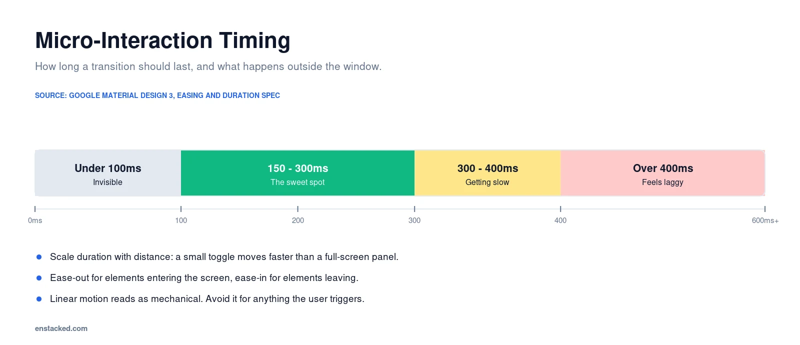
- Under 100ms. Effectively invisible. The user perceives it as instant, which is fine for a hover but wasted on a state change.
- 150ms to 300ms. The sweet spot for most transitions. Long enough to read, short enough to feel snappy.
- Over 400ms. Starts to feel laggy. The user is waiting on your animation, not your server.
Scale with distance and size. A small toggle can move faster than a full-screen panel sliding in, and matching them makes the larger one feel abrupt.
Use ease-out for elements entering the screen and ease-in for elements leaving. Linear motion reads as mechanical.
Accessibility: The Part Most Guides Skip
Motion is not neutral. For users with vestibular disorders, parallax, zoom, and large sliding transitions can trigger genuine nausea and dizziness.
This is not a solved problem. WebAIM’s February 2026 analysis of the top one million home pages found detectable WCAG failures on 95.9% of them, averaging 56.1 errors per page.
That is up 10.1% on 2025, reversing six straight years of gradual improvement.

Operating systems expose a “reduce motion” setting, and CSS can read it directly. Honouring it is a few lines of code:
- Wrap non-essential animation in a
prefers-reduced-motionmedia query. - Do not remove the feedback, replace it. Swap a slide for a fade, or a bounce for an instant state change.
- Never rely on colour alone to signal validation. Pair red and green with an icon and text for colour-blind users.
- Announce dynamic changes to screen readers with an ARIA live region, so a “Saved” toast is not silently missed.
- Keep every hover-triggered function reachable by keyboard focus.
This matters commercially as well as ethically. Accessibility requirements are tightening across major markets, and motion sensitivity is squarely within scope.
How to Design Micro-Interactions That Earn Their Place
- Name the uncertainty first. What is the user unsure about at this moment? If you cannot answer, skip the interaction.
- Match feedback to consequence. Bigger stakes, stronger signal.
- Respect the timing window. 150ms to 300ms for most things.
- Build a pattern, not a one-off. The same behaviour everywhere it appears.
- Test on a mid-range Android. Animation that is smooth on a design workstation can stutter badly on real devices.
- Honour reduced-motion from the start. Retrofitting accessibility is always more expensive.
- Let analytics choose the next one. Session recordings show you where people hesitate. Build there.
Want micro-interactions that improve usability instead of just decorating it?
Hire Dedicated UI/UX Designer
To Wrap Up!
There is no neutral option here. Every micro-interaction either reinforces confidence or introduces a small doubt.
The ones worth building in 2026 are not the flashiest. They are the ones that answer a real question fast: did that work, is something happening, and did I get that right.
Get those right and users will call your product intuitive without being able to point to a single reason why.
If you would like to bring that standard to your own product, Enstacked can help. Our UX/UI design services helping businesses take their digital presence to the next level.
Book a free consultation call now.
Frequently Asked Questions (FAQs)
What is a micro-interaction, in simple terms?
It is a small design moment that responds to something the user did. A button changing on click, a field turning green as you type, or a progress bar filling during an upload.
Each one answers a single question: did that work?
How long should a micro-interaction last?
Between 150 and 300 milliseconds for most transitions, in line with Material Design guidance.
Under 100ms is effectively invisible, and over 400ms starts to feel sluggish. Scale the duration with the size of the element being animated.
Do micro-interactions slow down a website?
Not if they are built correctly. Animate only transform and opacity so the work runs on the GPU, and avoid animating layout properties like width, height, or top.
CSS scroll-driven animations run off the main thread, which makes them cheaper than the JavaScript equivalents they replace.
How do I make micro-interactions accessible?
Wrap non-essential motion in a prefers-reduced-motion media query and swap movement for a fade or an instant change rather than removing feedback entirely.
Never signal state with colour alone, and announce dynamic updates through an ARIA live region so screen reader users are not left out.
How do you build micro-interactions in Figma?
Use the Prototype tab. Smart Animate handles transitions between frames, and interactive components let you build reusable hover, pressed, and disabled states for buttons and toggles.
Set your easing and duration in Figma to match what will ship, otherwise the prototype will feel different from the build.
What are the micro-interaction trends for 2026?
AI streaming and thinking states, skeleton screens replacing spinners, optimistic UI updates, CSS scroll-driven animation, and native view transitions between pages.
The wider shift is away from decorative motion and toward interactions that reduce perceived waiting and prevent errors.
Can too many micro-interactions hurt user experience?
Yes. Motion without a trigger teaches users to ignore your feedback, so the signals that genuinely matter stop registering.
Celebrate real milestones only, and keep every effect tied to a specific moment of user uncertainty.

- Recover Lost Sales
- Boost Conversions
- Reduce Abandonment
- Faster Store
📘 FREE REPORT
The Shopify Revenue Leaks Report
Discover the hidden mistakes silently costing Shopify stores thousands every month—and learn exactly how to fix them.
Instant access • No spam • Unsubscribe anytime.